What do McDonalds, Burger King, KFC, Pizza Hut and for those old enough to remember it, Wimpy have in common?
Answer: the predominant colour of their logo is red.
Coincidence?
No, it is certainly not.
Research shows that the colour red evokes strong emotions, stimulates appetite and also promotes impulse decisions. Hardly surprising that these companies all went with the same brand colour.
However, in the last couple of years, since the supermarkets have put nutrition charts on food packages, with red meaning too much salt or fats, have you noticed how McDonalds have changed their restaurant branding to a dark green? That’s the colour that signifies health and nature; much more desirable attributes for McDonalds to be associated with. Starbucks were already ahead of the curve and have used the same colour for years, moving away from their original brown logo, for the same reasons.
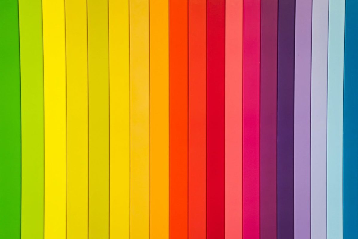
Exhibition stands are a very different industry to fast food chains, but the theory and practise behind these colours remains the same. Without even realising it, the colour of your company logo could be subliminally saying lots about you. Look at the headline emotions that the most popular colours trigger. When you understand the emotions that each colour promotes and look at the companies who choose each colour, it can make very interesting reading:
Red – Promotes strong emotions, encourages appetite, increases passions and intensity. Used by McDonalds, Coca-Cola, Kellogg’s and Heinz.
Green –Synonymous with calm, freshness and health. Promotes nature and new growth. Used by Land Rover, BP, Starbucks and Tropicana.
Blue – Thought to put people at ease, as it is reminiscent of the sky and ocean. Creates a sense of security and trust but curbs appetite. The most popular brand colour, used by the NHS, American Express, Facebook and Ford.
Purple – A sophisticated colour. Associated with royalty, wealth, success and wisdom. Used by Yahoo, Hallmark and T-Mobile.
Yellow – Communicates hope, cheerfulness and optimism. Encourages communication and energy. Used by Shell, Yellow Pages and DHL.
Orange – Reflects a combination of the cheer of yellow and the passion of red. Colour is associated with being full of life, excitement and enthusiasm. Used by Nickelodeon, Harley-Davidson and Fanta.
Whilst changing your company branding and logo in light of any revelations above may not be an option, it is certainly possible to ensure that the prominent colours on your stand are connected to your brand values and the emotions you need to tap into with your perspective clients.
Look at the following exhibition stand images and consider how the general stand colour actually creates the impact that the brands are looking for:
American Express

American Express is a household name and the logo itself is blue, but in the below stand in February 2017, they used multiple shades of blue to give the stand a calming, trusted and secure feel; exactly the impression they want to create about their brand for new and existing clients.
Prezola

Prezola are the UK’s leading online wedding list company. Their logo is a fairly neutral but confident grey colour; however, their exhibition stand uses strong shades of purple. The aim of the stand was to be absolutely top of their market. Purple is a complex colour, associated with affluence and achievement, attributes Prezola were trying to appeal to at the exhibition.
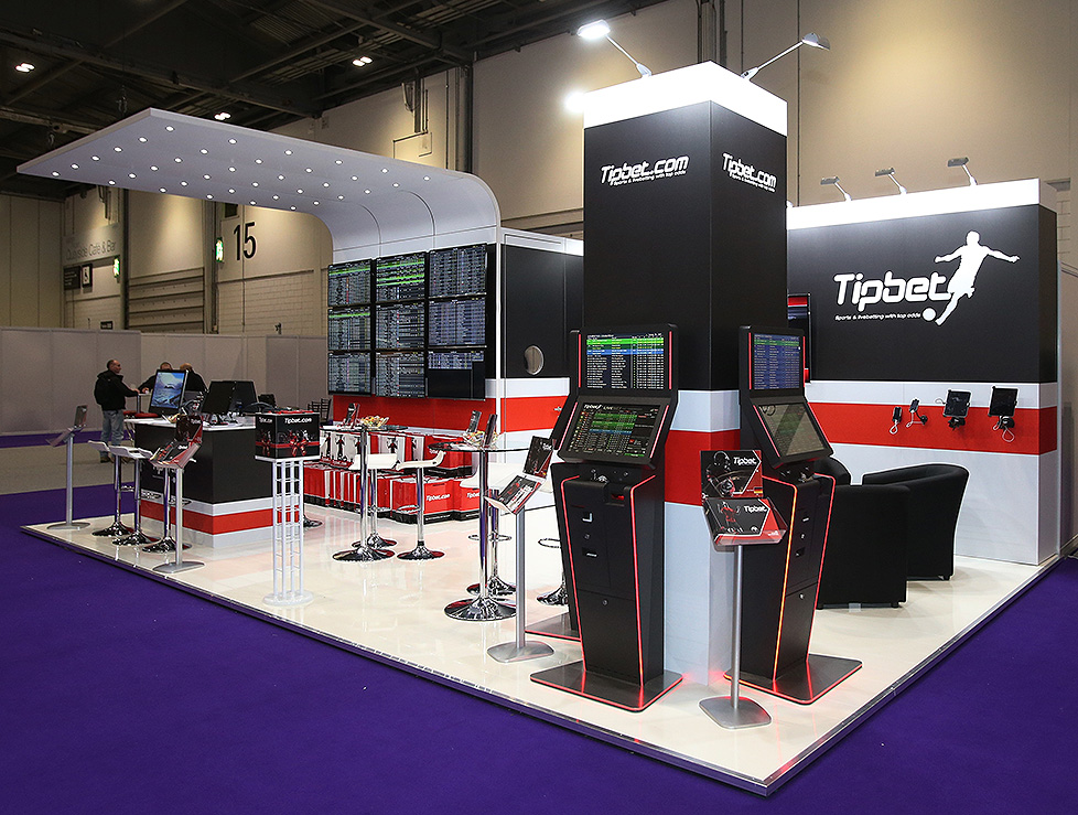
Tipbet

Tipbet, a relatively new online gambling company attended ICE Totally Gaming in 2016 with a very clean stand, showing a number of their sports trading terminals. Their colour choice was black and white, which gives crispness and authority, but there is a prominent spread of a bold red that triggers instinctive behaviour, something all gambling companies try to tap into.
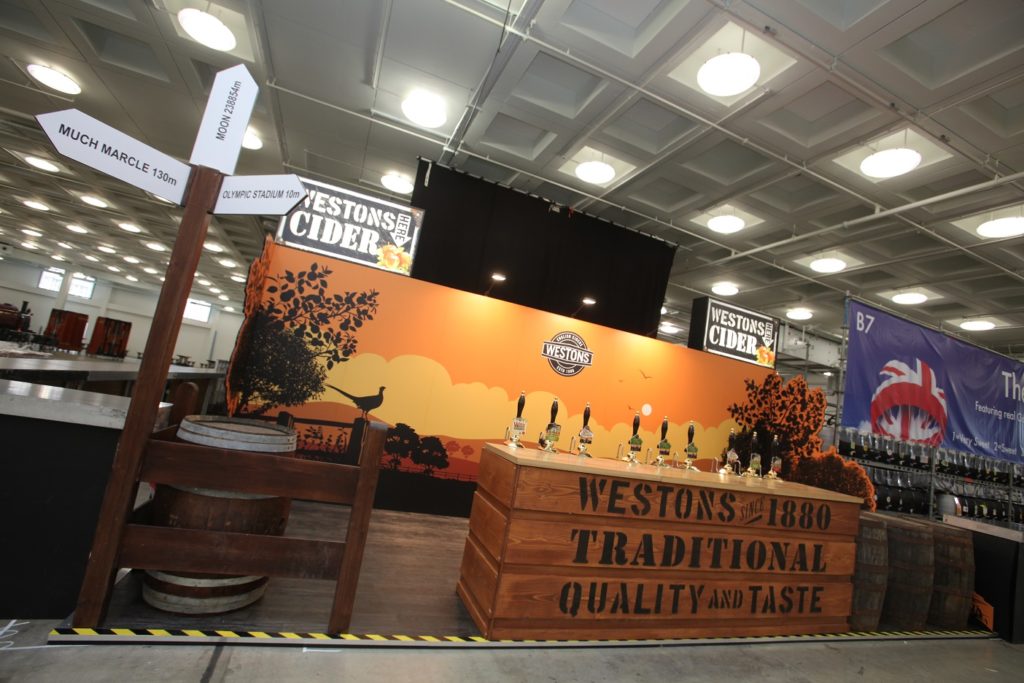
Westons

Westons Cider have a logo that is predominantly black; however, at this beer festival, the stand had a strong wash of yellow which promotes cheerfulness and sun. The very specific thinking was that cider is a drink associated with summer; therefore, if you can give a summery feel on the stand then visitors will be more inclined to try the cider on offer.
A few simple examples of how regardless of the colour of your company logo, the main or even secondary colour of your exhibition stand can say a huge amount subconsciously to the exhibitors. The colour of your stand really does matter.


